
Build a Wealthy Spirit
I was beyond excited Michelle and Sammie, the hosts of the Status Post Adulting podcast, reached out to me to help them design their logo and cover image for their rebranded podcast: Build a Wealthy Spirit.
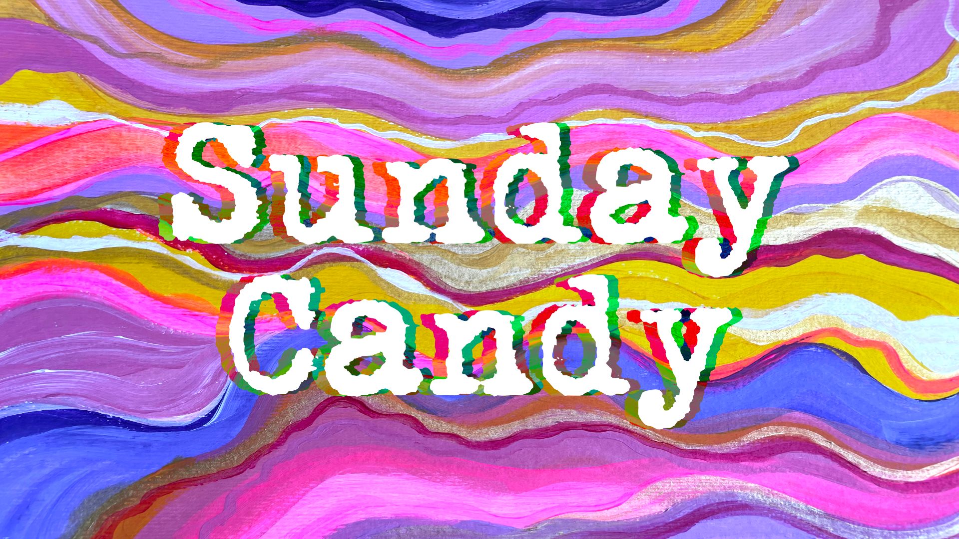
But how did this happen? Michelle and I met while taking Write of Passage. I just finished a collab with another one of our friends, Sandra Yvonne, for her Newsletter Sunday Candy. Michelle retweeted Sandra’s tweet announcing our collab with the kindest words.
Collaborating with Sandra was so creatively satisfying, that I wanted to do it again. So I replied to Michelle, offering to collaborate, and this happened:
I meannn in that case 🙃
— Michelle Varghoose (@mvarghoose) January 31, 2023
A few hours later Michelle messaged me, asking if I would be interested in working on a logo and cover image for her podcast’s rebrand. We hopped on a call and the rest was history. It was an incredible 3 weeks. I learned so much about branding, collaborating, and graphic design.
Becoming a freelance graphic designer was something I always dreamed of, and this was my first step towards making that dream a reality. I knew I had to be thorough and take the whole process one step at a time.
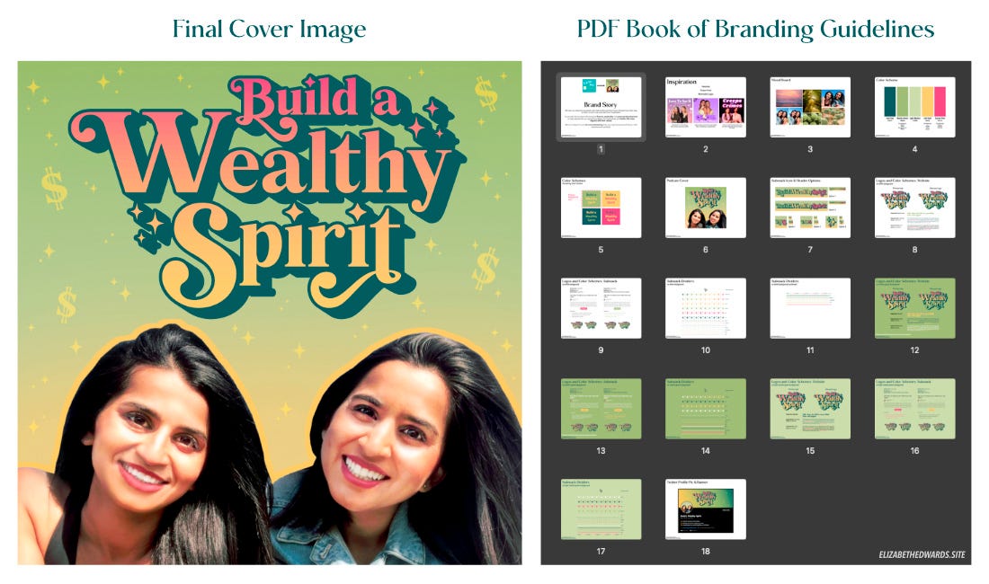
At every stage of the design process, I emailed Michelle and Sammie a PDF book with options. This PDF book slowly documented the chosen option of each round. At the end, the PDF book became the branding guideline for Build a Wealthy Spirit.
Below is a breakdown of the design process:
Brand Story, Mood and Inspiration
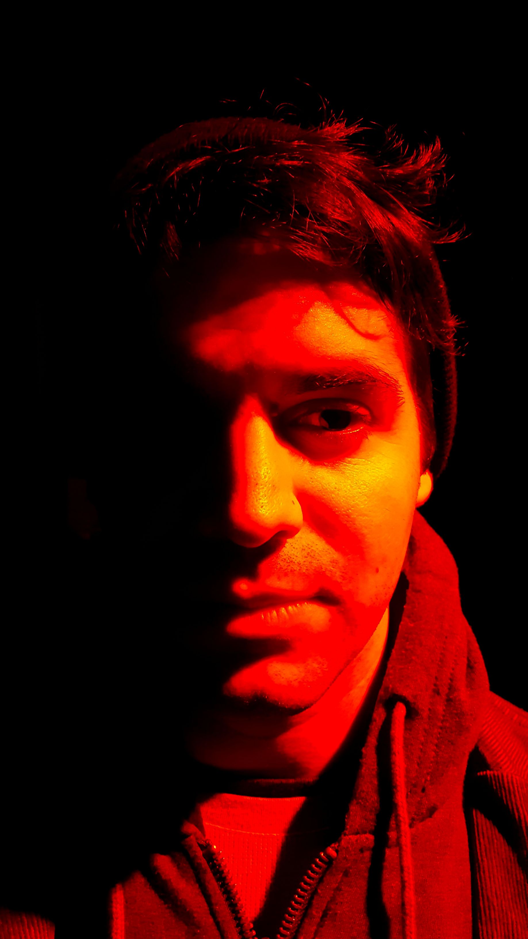
Michelle and Sammie made the beginning of the design process very easy because they came prepared. Not only did they have a clear brand story, but they also had a mood board and podcast covers they were inspired by. They also did a photoshoot for their rebrand and gave me their three favorite photos to create options with.
This is their brand story:
“We see our listeners as people who feel as though they have checked box their way to their current lives and feel a bit unsatisfied.
So we talk about topics like personal finance, spirituality and personal development to help people set up a good foundation for themselves and build a life more aligned with their values.
We try to keep it more fun and entertaining than your typical personal finance / self development podcast.”
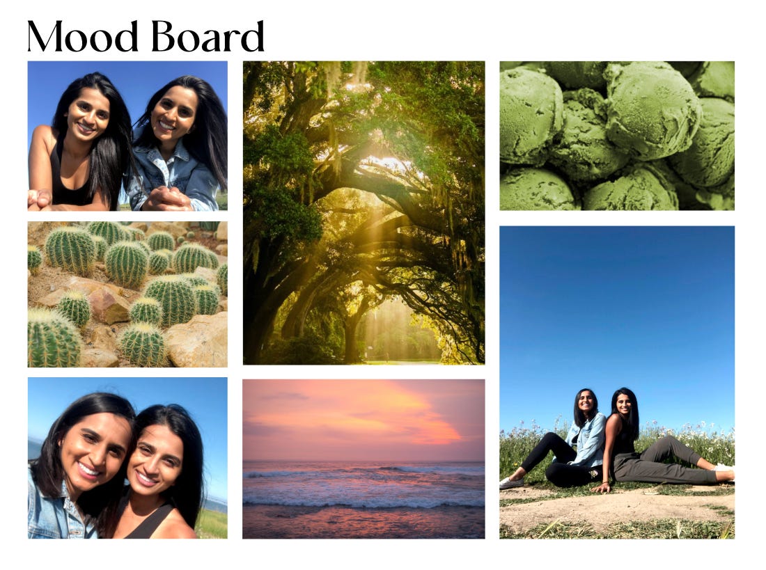
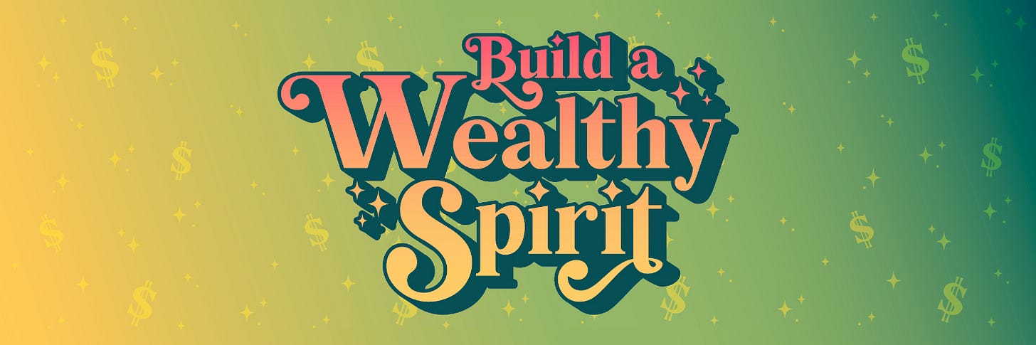
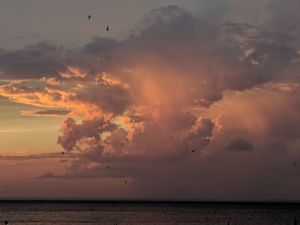
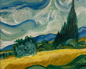
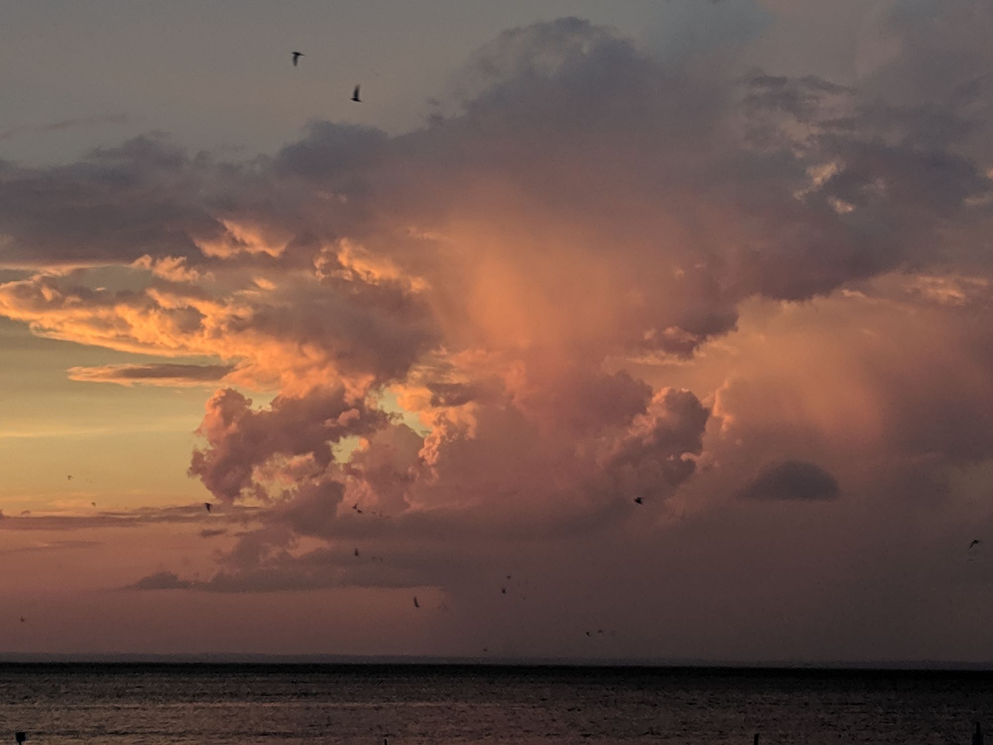
The prominent greens and golds stood out to me the most in their mood board. This is perfect because we typically associate green with money, and gold with wealth. Personal finance, covered.
The hazy gold sunlight shining down through the trees and the gold sunlight peeking through the beach at sunset felt very spiritual. But gold is a form of yellow, which psychologically evokes curiosity and clarity. These things are needed for personal development. Yellow also is bright and joyous, which is also associated with fun.
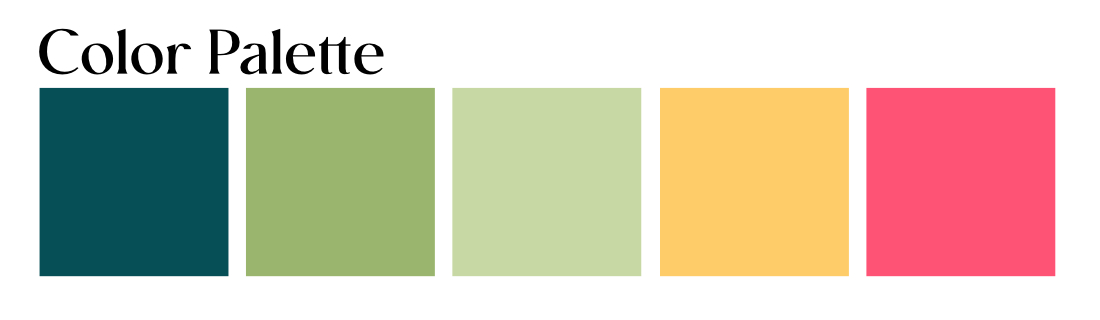
Based on all these associations above, I knew that green and yellow had to be the primary colors for Build a Wealthy Spirit’s visual brand.
I wanted to use an accent color within the logo to make it pop. Sunset pink complements the primary matcha green. But Michelle and Sammie wanted to make sure that their podcast cover and logo would appeal to all. The final sunset pink color leans a bit orange, so it highlights the podcast’s warm and uplifting energy.
Font and Cover Photo Options
Michelle and Sammie were inspired by these three podcast covers below because they had memorable logos with unique fonts. I noticed that the logos are simple and feature a unique, bubbly, and bold font with minimal to no styling (like the thin outline in Chicks in the Office or the glowing light around Creeps and Crimes).
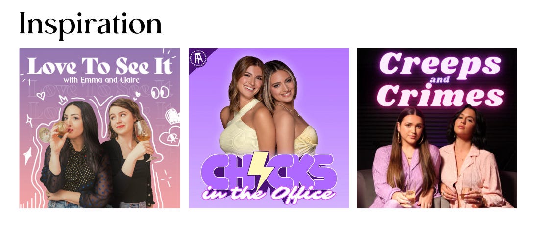
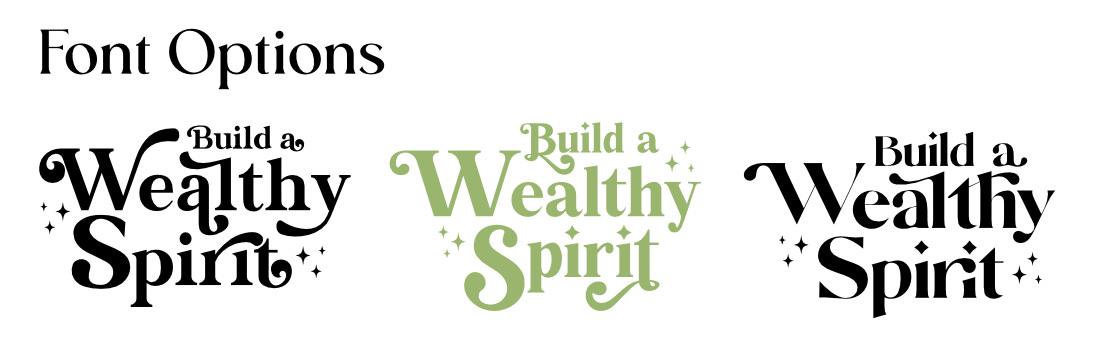
Font speaks a lot about a brand. I started with a serif font, because serif fonts are historic and traditional, much like financial institutions. Next, I looked for bubbly and bold fonts, like the podcast logos above, but with a magical flair. ✨
Michelle, Sammie, and I all resonated with the green option below. It’s easiest to read and would still be legible if the podcast cover is shown at a small scale.
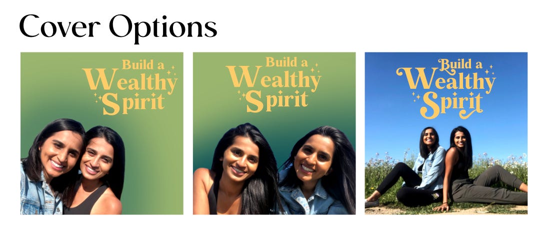
Then I started to test options for the cover photo. I arranged the logo with the images from their photoshoot. They chose the center option for the final cover photo image.
Final Logo and Cover Image Styling
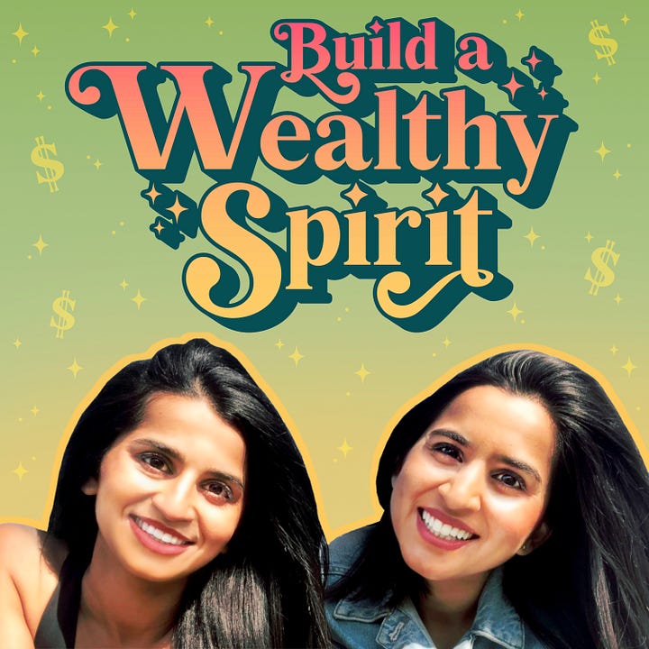
Michelle and Sammie felt that the sparkles in the logo were spiritual and magical. So I decided to sprinkle them around for texture in the background. Then I added some dollar signs to emphasize the personal finance element of their podcast.
I also did some touch ups on the original photo to remove the contrasting shadows on their faces and give them both an additional glow. I used a gradient on the logo, starting with the sunset pink at the top, that gradually fades down to the yellow glow behind their faces. The alternate logo on the right incorporates that primary matcha green color and is meant to be used on light colored or white backgrounds.
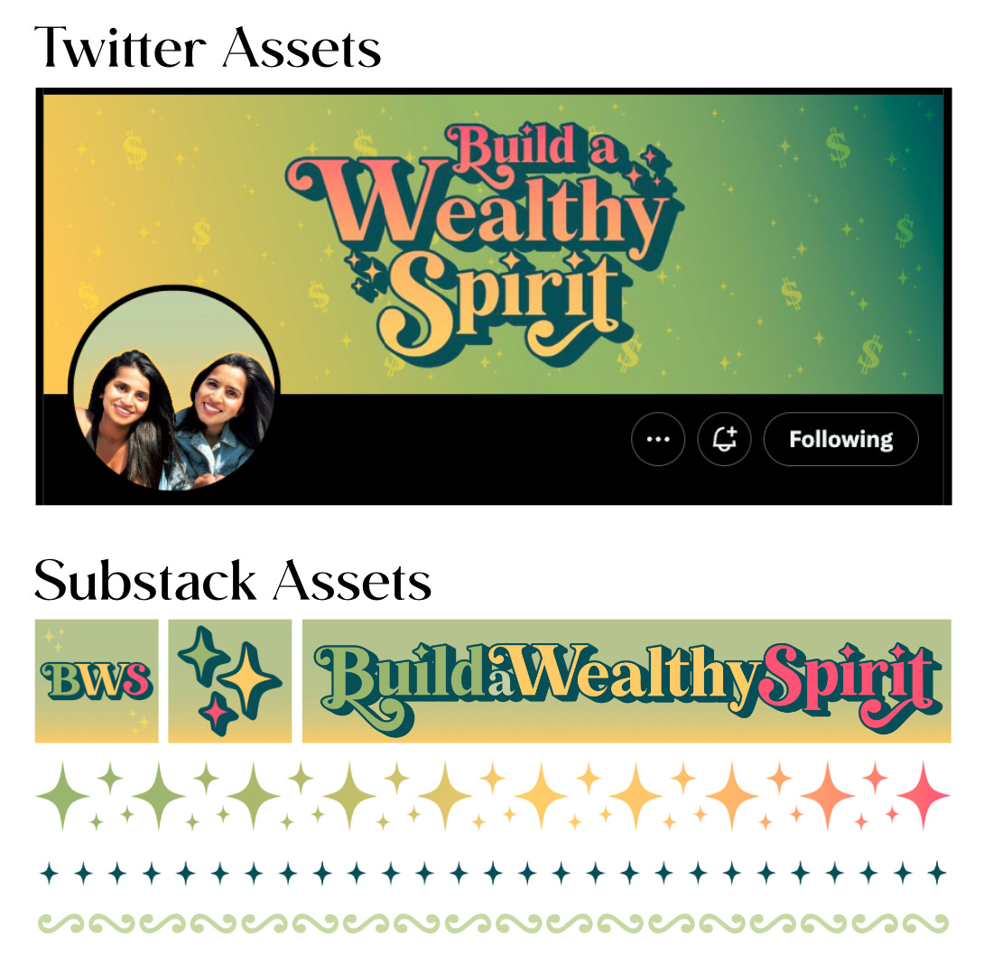
Additional Assets
In addition to the logos and podcast cover photo, I created some additional assets/images for Michelle and Sammie to use on other platforms. I designed a banner and modified profile picture for Twitter. For Substack, I created publication icons, watermarks, as well as horizontal dividers.
Make sure to check out Michelle and Sammie’s podcast Build a Wealthy Spirit HERE.
If you’re interested in branding services, email me at liz@elizabethedwards.site

Special thanks to Sandra Yvonne for providing valuable feedback on this essay.


